AIRcub
Toutes les créations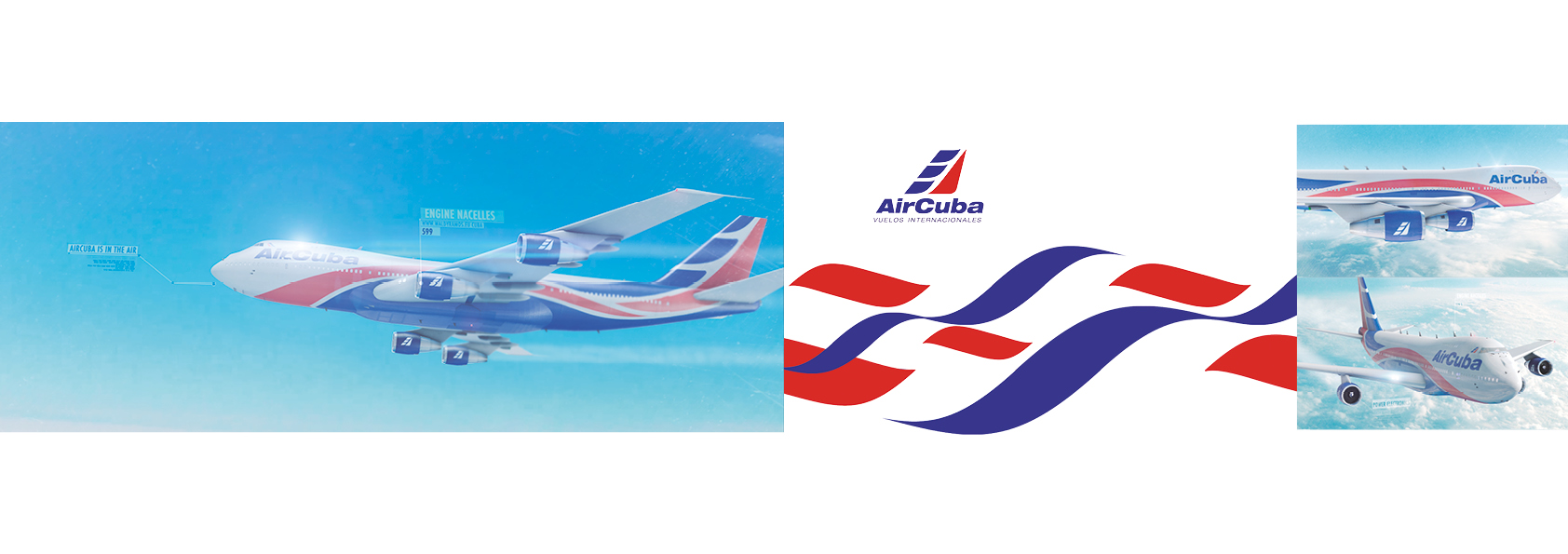
Waldy Ramos carbo
Directeur artistique, Créatif, Designer
Voir le profil
AIRcub
For 2005, Cuba Airlines looked to WYWY studio for a complete redesign of their corporate identity, Before we start arguing over whether or not this new design ruins the integrity of the brand, let’s judge it as a standalone piece. The shape “the flight symbol” highly suggests the tail of an airplane, which is perfect for an airline. They don’t take the metaphor too far, but it’s blatant enough that few will think of anything else when they see the shape. Interestingly enough, Cubana Airlines never even mentions this resemblance in all of their discussions of the new logo. Instead, they bring up two other factors about the shape: the flag and the star Obviously, the new logo is an abstraction of an flag in flight. It’s subtle and sleek. If you’re comfortable in analyzing negative space, the “wind” is a nice little surprise once you get your brain to see it. The colors. Thankfully, we’re still showing off that Cubans pride with red, white and blue. All three of these colors have a gradient applied now though, an interesting choice given that current trends are leaning towards flat. They look sleek and attractive as opposed to cheap and trendy. Along with the new logo comes a new design for the graphics on the side of the plane, which are referred to as the “livery”. Where the older planes simply had the logo on the tail, the new design features an abstraction of the Cuban flag.
< Précédente
Suivante >
For 2005, Cuba Airlines looked to WYWY studio for a complete redesign of their corporate identity, Before we start arguing over whether or not this new design ruins the integrity of the brand, let’s judge it as a standalone piece. The shape “the flight symbol” highly suggests the tail of an airplane, which is perfect for an airline. They don’t take the metaphor too far, but it’s blatant enough that few will think of anything else when they see the shape. Interestingly enough, Cubana Airlines never even mentions this resemblance in all of their discussions of the new logo. Instead, they bring up two other factors about the shape: the flag and the star Obviously, the new logo is an abstraction of an flag in flight. It’s subtle and sleek. If you’re comfortable in analyzing negative space, the “wind” is a nice little surprise once you get your brain to see it. The colors. Thankfully, we’re still showing off that Cubans pride with red, white and blue. All three of these colors have a gradient applied now though, an interesting choice given that current trends are leaning towards flat. They look sleek and attractive as opposed to cheap and trendy. Along with the new logo comes a new design for the graphics on the side of the plane, which are referred to as the “livery”. Where the older planes simply had the logo on the tail, the new design features an abstraction of the Cuban flag.
Votre opinion (0)